The Bistro Group
UI/UX Design Study
Tasks
UX Research
UX Design
UI Design
Timeline
2.5 weeks
Industry
Food and Beverage
Sections
Overview
The Bistro Group is a collection of international hospitality casual dining brands and homegrown concepts in the Philippines.
Problem
The Bistro Group website is a landing page with multiple links that scrolls down to the specific category. While the site appetites the viewer, the content can be cluttered at times.
The Problem
Analysis
Sitemap
The Bistro Group is a long landing page with multiple links. Each section is cluttered with details, important or not.
Analysis
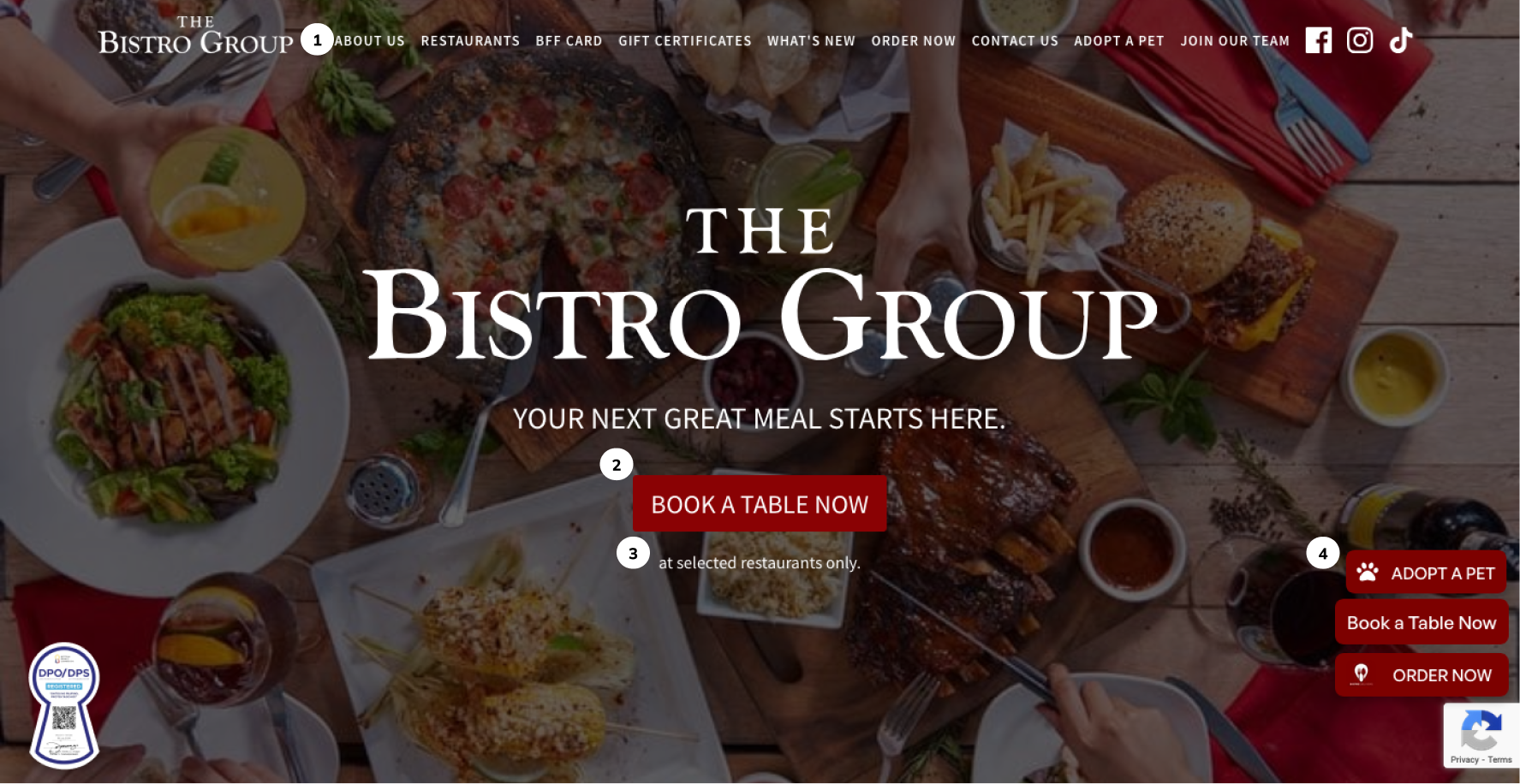
Home Section
- There are too many links on the top navigation.
- Book a table CTA is not that visible, especially to visually challenged viewers.
- Disclaimer can be shown elsewhere.
- The CTA buttons on the bottom right side are duplicates of the top navigation. Since the top navigation is sticky, these are unnecessary.
Analysis
Restaurant Gallery Section
- The long body of texts is hard to read— the space is too narrow.
- Food looks floating in the middle of the page.
- The card on the right of the screen imbalances the layout.
- Overall, the gallery contains a lot of content, and the dots on the bottom are too exaggerated.
Analysis
BFF Promotion Section
- Background use affects the overall readability of the content. The promo ad looks out of place.
- There are issues with the Play Store and App Store logos as they are not visible.
- The listed logos at the bottom of the page are redundant since there is a section dedicated to the restaurants.
Analysis
About Section
- Accessibility issue— there is a small text on the pictured background
- There are no headers used.
- The letter for guests looks out of place. There is no continuity between the About section and this one.
Side by Side, Now vs Proposed
Detailed solutions
Solution
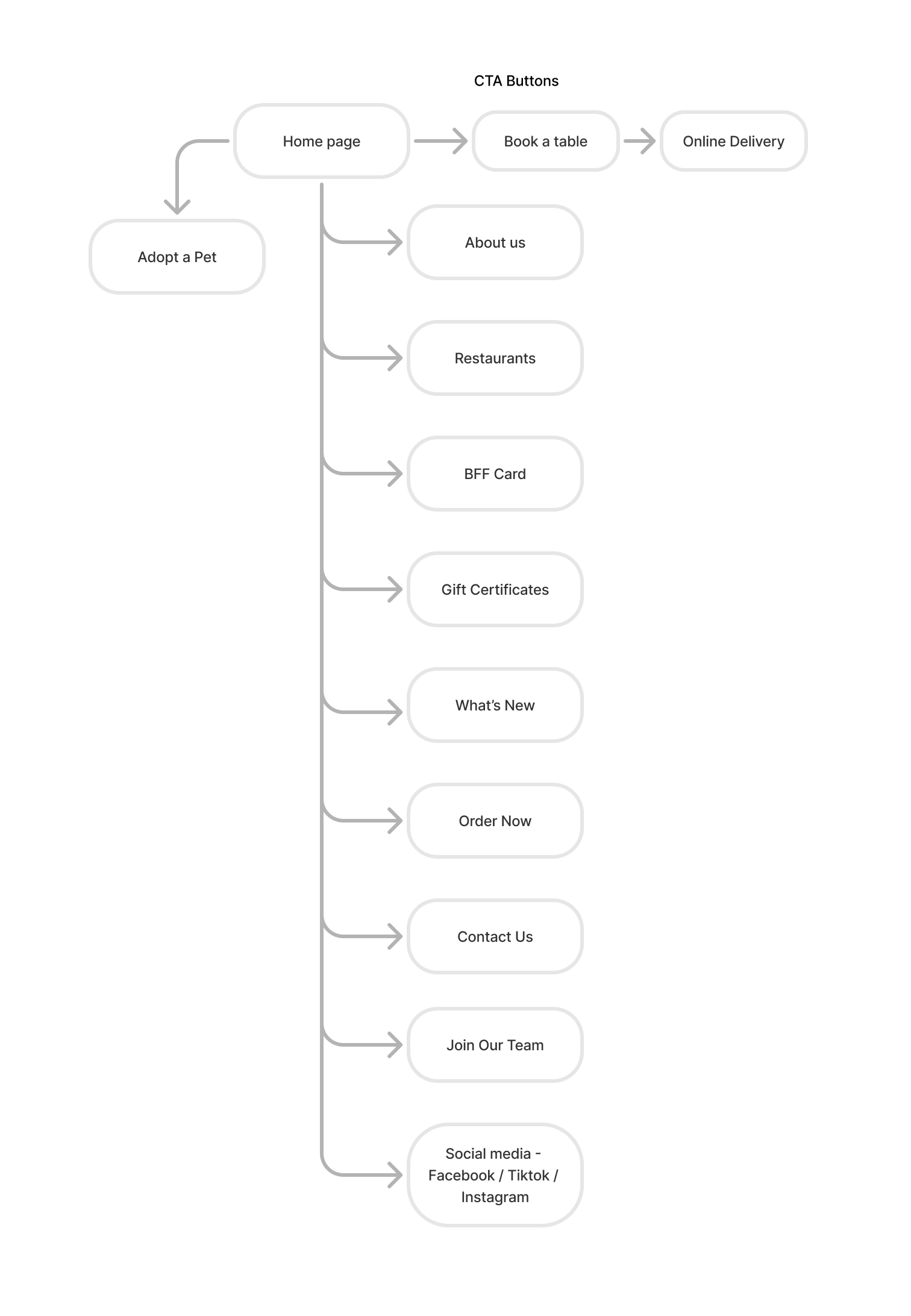
Sitemap
I have decided to split the sections into multiple pages. It makes the segregation of the details and info easier.
Solution
Home Section
- Lessen the sections of navigation and, if possible, add pages instead.
- Move some of the CTA buttons on top in the navigation and retain the one in the middle.
- Use tones of red to clearly see the CTA button in the middle.
Solution
Restaurant Section
- Instead of using a gallery, I would place the content (pictures and texts) on another page to showcase it effectively.
- Seeing more than three items in the gallery can be boring and make it difficult to find specific details, so I recommend splitting the sections into three categories (The Bistro Group, Bistronomia, TBG Elite) using tabs.
Analysis
Promotion Section
- Use a background that complements the promotional ad. Since the banner ad is replaceable, a less busy background will work better overall.
- Use the complete version of the App Store and Play Store logo.
- Remove the restaurant listings.
Analysis
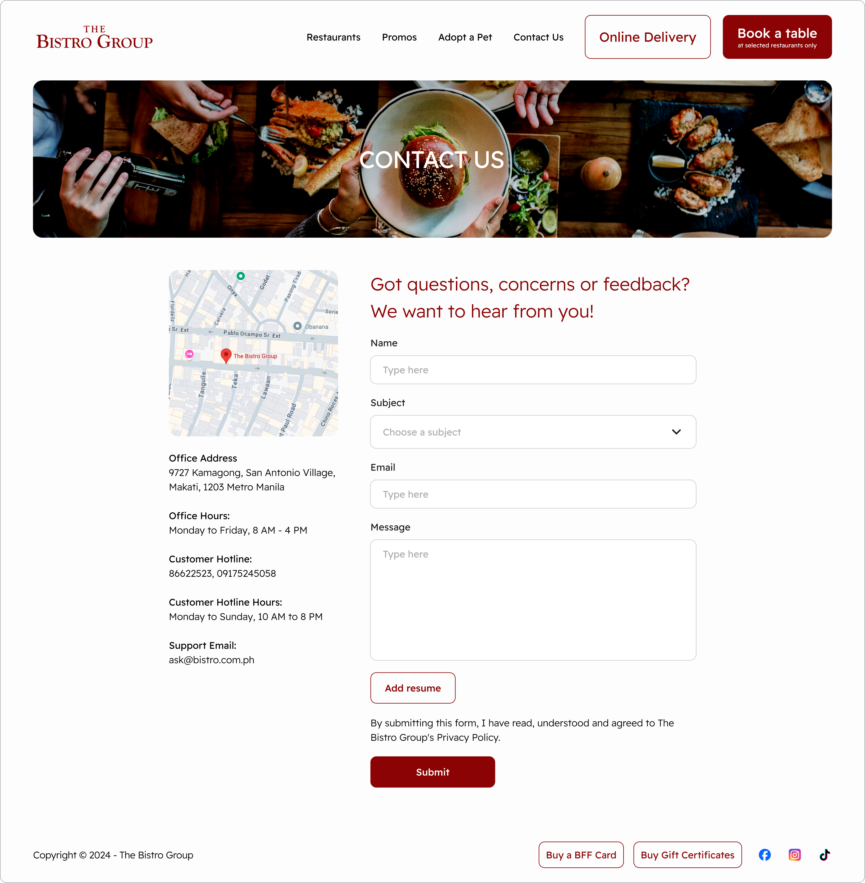
Contact Section
I think the forms can be merged—add the CV/resume button on the main input form to lessen the content.