Kijiji
Mobile App UI/UX Design Study
Tasks
UX Research
User Persona
User Journey
UI Design
Timeline
2.5 weeks
Industry
E-commerce

Sections
Overview
Kijiji is one of the pioneers of online buying and selling in Canada since 2005. The platform provides both sellers and buyers with excellent opportunities to earn and save money, respectively. It offers various categories including Electronics, Hobbies and Sports, Fashion, Decor, Pet Accessories, as well as Jobs and Real Estate.
Problem
Despite its popularity, Kijiji's user experience design has areas that could be improved. These improvements include reducing the number of advertisements through a paid account option, offering more comprehensive filters, and enabling users to save searches within the app, among others.
Let me post a detailed listing
Feature
Post a Listing
One of the main features of Kijiji is posting a listing. Let's see how is the experience of Maxie going through the feature.
Maxie, 36
Guitar Pedal Collector from
Vancouver, Canada
Persona
Journey Steps
Examine
Post a listing 🙂
Elect
Filling out details 😕
Evaluate
Most details are optional 😟
Condition of the item can be more specific 😟
Entrust
Will post again to sell 🙂
Pain Points and Opportunities
Examine
Looking at the forms can be too overwhelming
Elect
Inputting details can be skipped, no required fields
Examine
Lack of transparent information on the posted item
Entrust
Seller can be unreliable
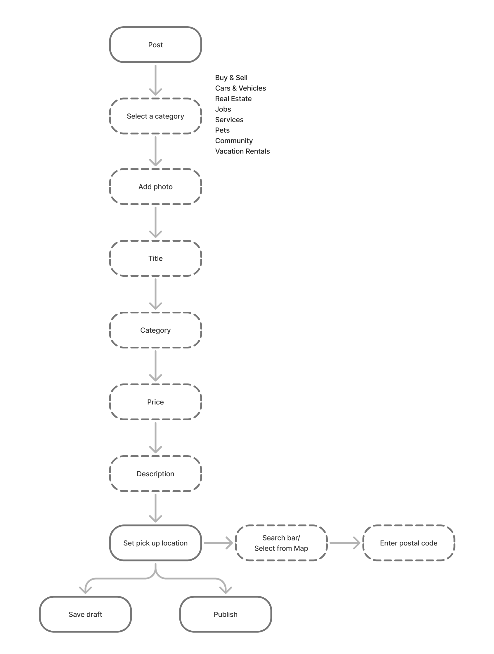
Feature: Post a Listing
Current Userflow
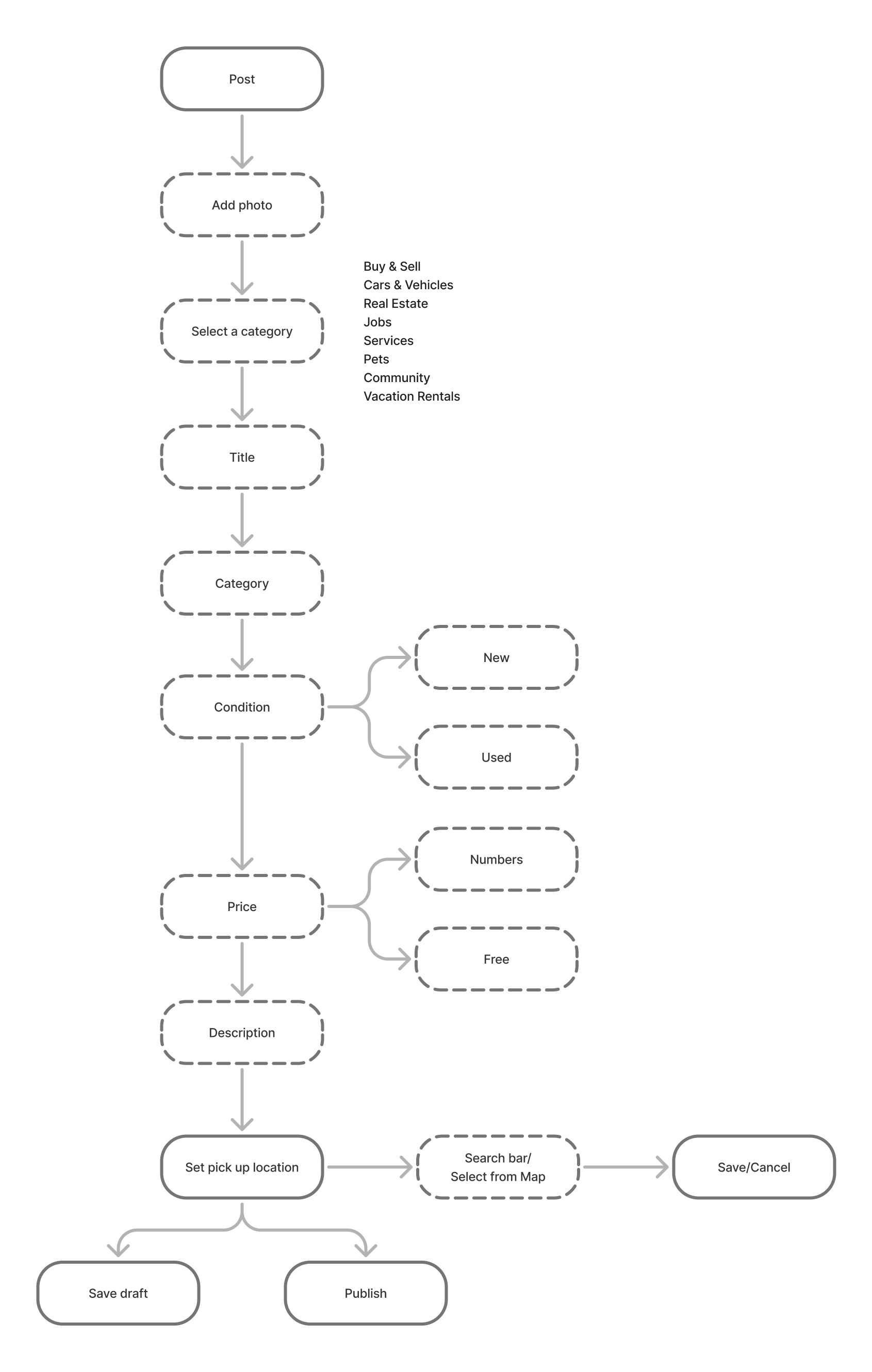
Proposed Userflow
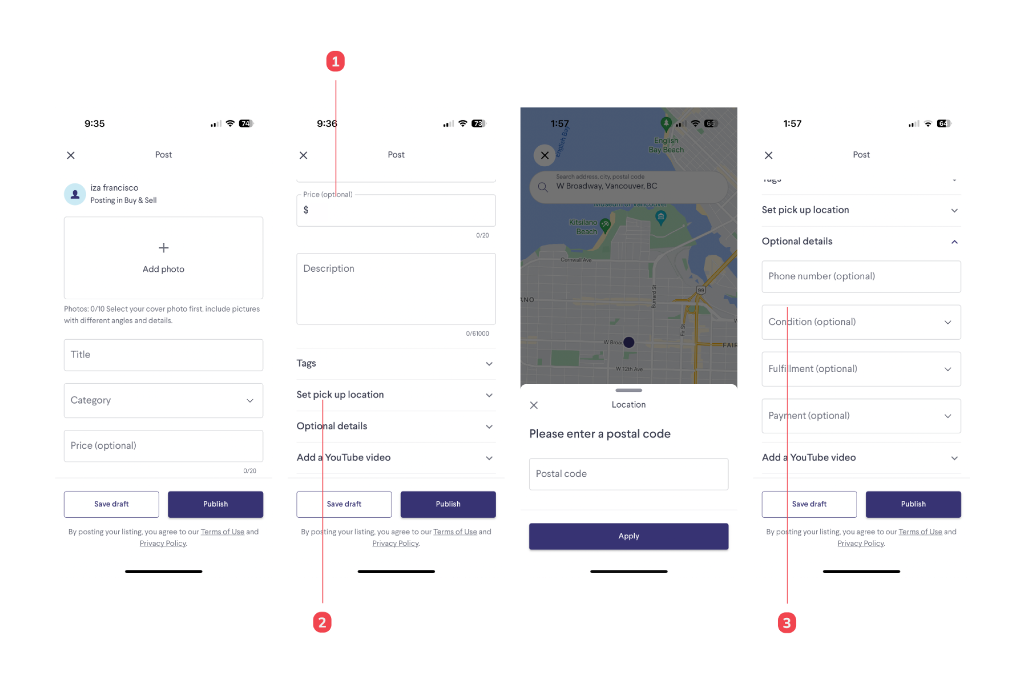
Current UI/UX
Notes
- Price listings can appear in both numerical ($50, $0) and non-numerical formats ("FREE"). Standards should be in place to unify labels and functions.
- Needs to provide a postal code for the location, it can be a privacy or security problem
- Condition can be more specific
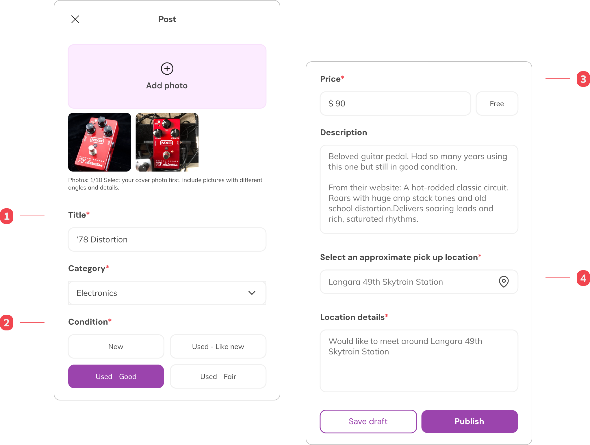
Proposed UI/UX
Notes
- Users must fill out the required fields
- Users can tag their item condition from the four options provided
- Users can input a specific price, otherwise they can select the free tag that will be shown as “FREE” for the price
- Users have the option to set approximate location for privacy and security
I want just want to save my search
Feature
Save a Search
Users can save a search but Angel does not want to bother going to her phone's setting and change her notification preferences.
Angel, 30
A Thrifting Fan from
Vancouver, Canada
Persona
Journey Steps
Examine
Search for an item 🙂
Elect
View Results 😕
Evaluate
Need to change the system setting in order to save a search 😠
Need to turn on notification settings to save a search 😠
Entrust
Did not save a search because of the notification setting 😠
Pain Points and Opportunities
Examine
Search for an item
Elect
Too many buttons to filter out the results
Shows irrelevant results
Examine
Save a search is turning on the notification
Entrust
Need to make the search again when user is ready to buy
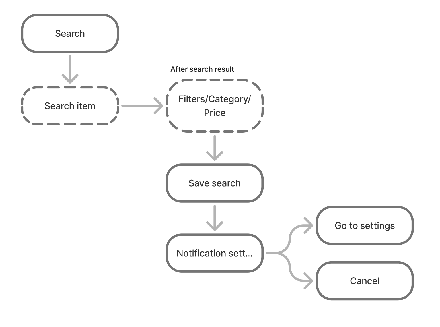
Feature: Save a Search
Current Userflow
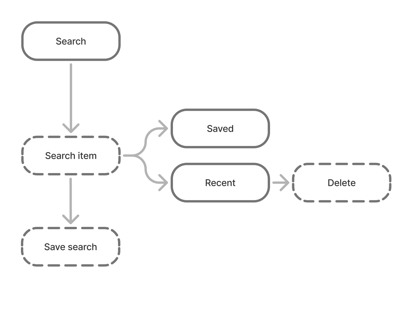
Proposed Userflow
Current UI/UX
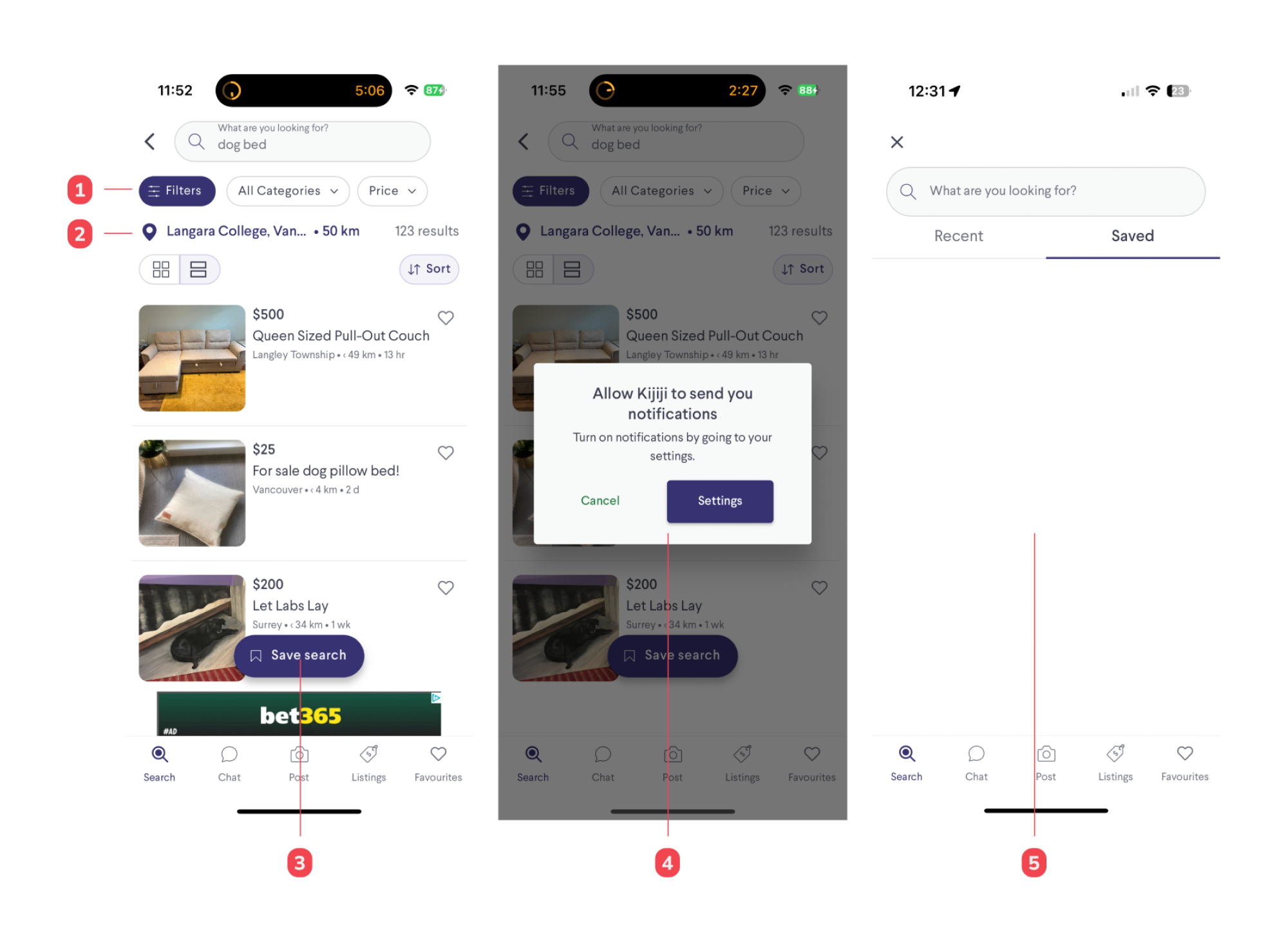
Notes
- Filter buttons are far from the search results
- Interchange filter buttons and location pin
- Save button is barely seen against the listing or ads posted
- After trying to save a search, it can be confusing to the user why the function is connected to the phone system notification.
- Unless the users change their notification settings in their phones, their search will not be saved
Proposed UI/UX
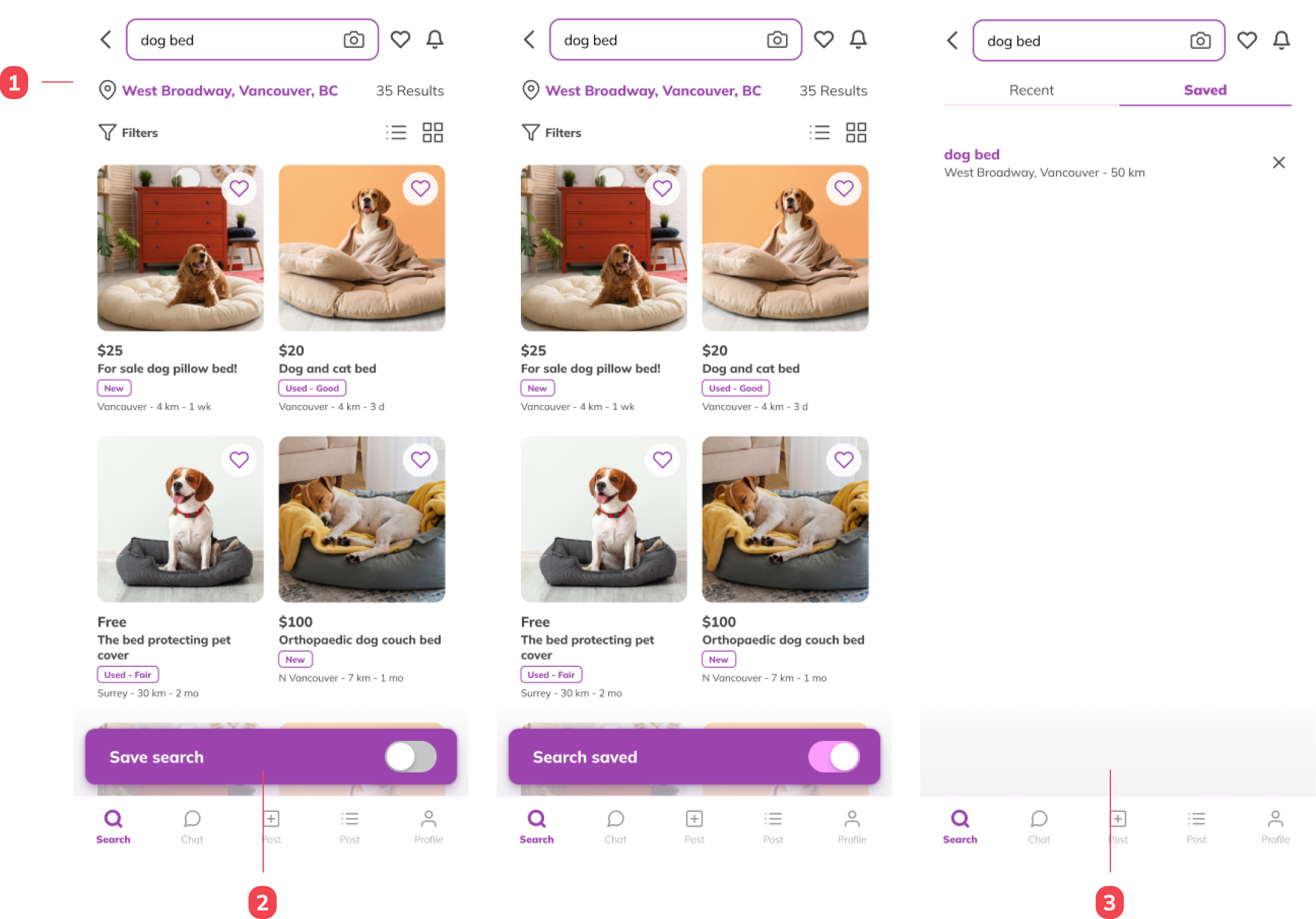
Notes
- The map and filter buttons have been interchanged to create a closer connection between the filters and the search results.
- Users can quickly turn off and on a saved search via the fixed save search field.
- Users can access their saved searches in the search bar under the "Saved" tab. They also have the option to delete a search directly from this tab